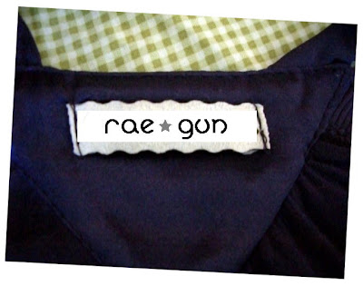
I’m working on improving the whole Rae Gun look. I’ve been talking to artists and designers about new graphics and layouts and I want better quality woven tags. I was thinking I wanted the scallop edge tags so I’ve been experimenting. The musicmaker wants me to wait until my new raegun graphic is finished and think it makes sense to put that on the label but I’m not sure how that would look on the scallops or if I should not do scallops and go with the ray gun. Remember these are the tags that go on the outside of the garments so they can’t be big but I want them to be legible or at least identifiable. So what do you guys think? Any ideas, do you like what I’ve got going so far? Any better font ideas? I’d really appreciate any input or maybe links to tags that you really like that I can use for inspiration.
Can You Help? Please?
This post may include affiliate links. This means if you shop through my link, I will earn a small commission, but it won’t cost you anything extra.


jkziel says
hmmm…I think the ray gun graphic would be ok, unless you want the name rae gun to be the main focus and not really small, because the graphic would shrink the brand name unless you increased the size of the tag. What I did, was have mine fold in half, the ivy & mae logo (which includes the name and birds) and on the back the sizing info. It worked for me having it fold, but I could save some room because the logo has the brand name included. I’m sure it will turn out great, I like the scalloped look by the way.